Create your own custom reports using our custom report builder.
Advanced reporting is pivot tables that dissect the information inside your Magnetic account.
Please note:
- Our Advanced reporting tool does NOT do comparisons.
- All information fields in Magnetic are available including custom fields and profitability data.
These are the types of reports you could create using the Advanced Reporting tool to get useful and detailed insight into various aspects of your Magnetic account:
Using Time Entries
Tracked time per company for month
How much of our time tracked for the year is billable per month?
Billable and non-billable time tracked per user per month in MONEY
How much billable/non-billable time has each department tracked?
For Opportunities and Jobs
How much profit has each A.E. brought in over specified period?
Which job types do you work on the most?
Which client areas are making you the most profit?
For Tasks
Tasks grouped by statuses in next 30 day
Total assigned estimated effort on tasks per month per user
Item Types
Income per item type
Line item costs
Various sections in Advanced Reporting:
- Filters applied (as seen in other reports).
- Available fields to create the report from. These will include any custom fields you have set up,
- The area to drag and drop row fields.
- The area to drag and drop column fields.
- Dropdown of options for how to summarise the values to display in the table.
- Dropdown of options for how to display the report data (E.g. table or bar chart).
- Report display.
- Export to Excel - This is available for certain data views e.g when data is viewed in "table" form. (The export feature is not available for charts, graphs etc.)
How to populate your report:
- Start by choosing your report base module e.g Time Entries, Tasks, Opportunities/Jobs or item types (as explained above)
- Choose report type e.g table
- To choose the fields you want to display in your report, you can simply drag them one by one from the left-hand column and drop it in the corresponding column next to it.
- Your report will now start to populate as you start dragging and dropping your fields.
- Choose your data type e.g count or sum (explained in the section below)
- If you wish to export, simply click the export button.
- You can also save and favourited a report for future use.
Here is a screenshot showing the columns available for populating your report (these columns will vary depending on the type of report chosen e.g Item types, task, jobs, accounts.). They can be dragged into the space on the right to populate on your report.
Dropdown Options for Data type:
Count |
|
Sum |
|
List/Count Unique Values |
|
Average | A number expressing the central or typical value in a set of data. |
Minimum | Minimum value of a deal. |
Maximum | Maximum value if a deal. |
Dropdown options for types of tables/charts:
The data can be visualised in a number of ways:
Table: (Also know as a Pivot table) | A pivot table allows you to summarise data in multiple dimensions that you select by choosing fields to use on the x and y-axis that is displayed in a table. The value displayed in the table can be many different options such as the count of items found or the sum of a particular field. |
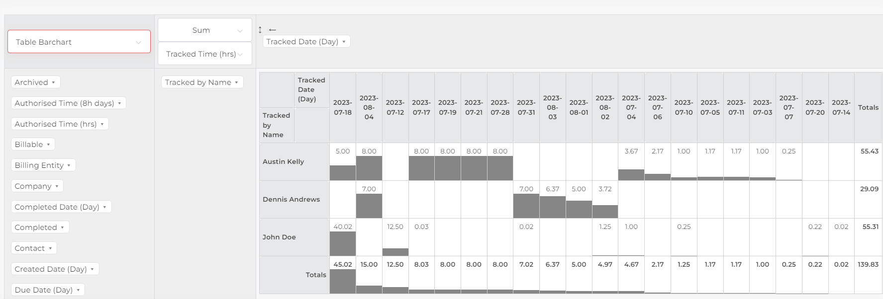
Table Bar Chart | Table with a bar chart within each line. |
Heat map: |
|
Line Chart |
|
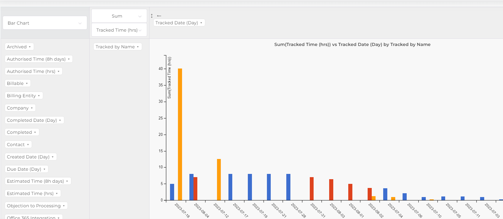
Bar Chart |
|
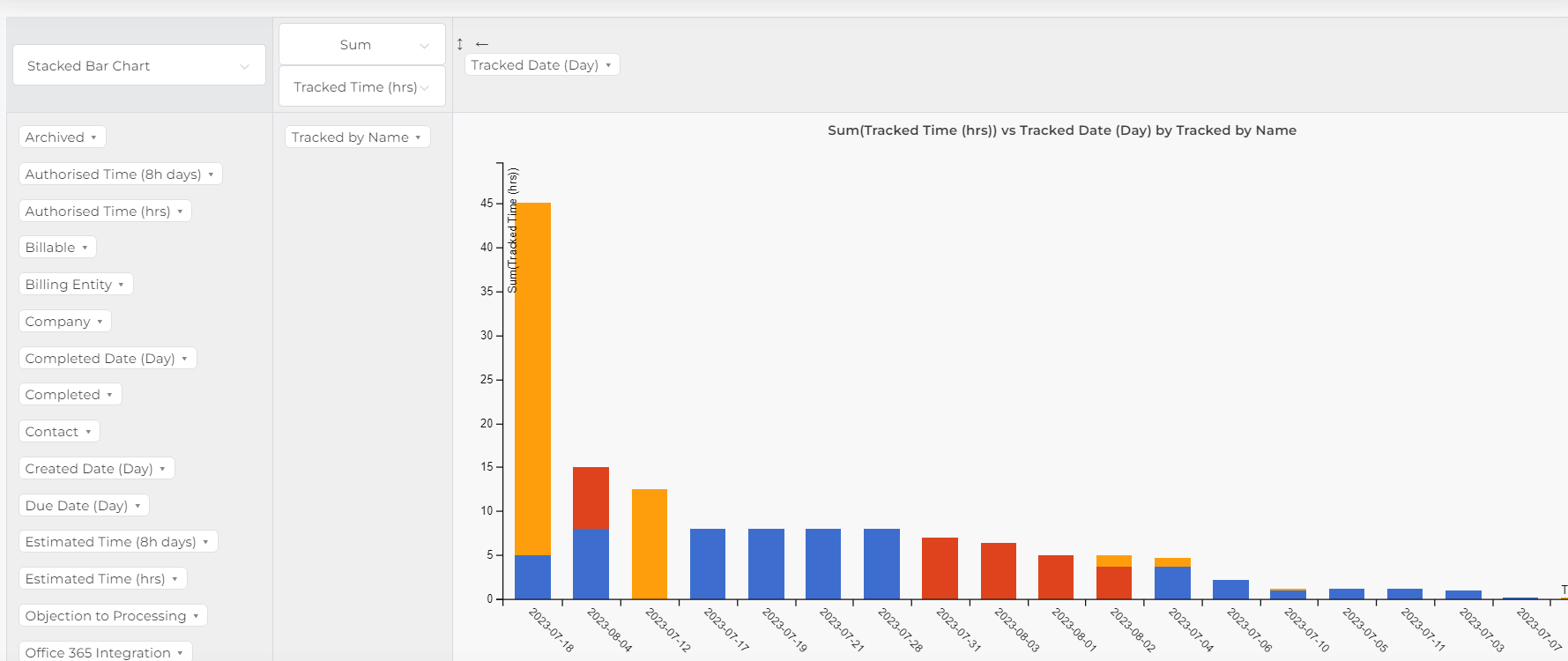
Stacked Bar Chart |
|
Area Chart |
|
TSV Report | This is basically an Excel/CSV export option. Copy the text and paste into a blank Excel workbook. The text is a Tab Separated list of values and will also be able to be imported into other spreadsheet software. |
Table with Subtotal Bar Chart |
|
Examples of different tables/charts:
Pivot table showing the sum of tracked time in hours by month by employee:

Table Bar Chart:

Row Heat map: Heat intensity is calculated for each cell with respect to its row only.

Column Heat map: Heat intensity is calculated for each cell with respect to its column only:

Line Chart:

Example of a Bar Chart:

Example of a Stacked Bar Chart

TSV Report:

Example of a Subtotal bar chart:

To export your report to Excel (only available for certain "Table" and "Heatmap" views) click the button highlighted below:

Tip:
Remember to use Saved Searches to save your new reports. The saved searches will appear on the dropdown menu under the "Advanced Reporting" icon.
Was this article helpful?
That’s Great!
Thank you for your feedback
Sorry! We couldn't be helpful
Thank you for your feedback
Feedback sent
We appreciate your effort and will try to fix the article